Cuckoo
Cuckoo
Sustainable Wooden Toy Website


About Cuckoo
Cuckoo is an online shop that sells sustainable wooden toys for kids. These handmade eco-friendly wooden toys are non-toxic, safe, gender-neutral, and created by local carpenters.
Project Overview
I was a UX/UI designer on the design team for this conceptual e-commerce website. We were asked to define a business and design a website with focus on User Interface.
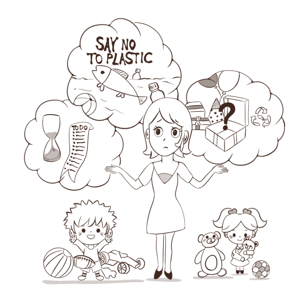
At first, we came up with a hypothetical stakeholder who loves kids and nature and is frustrated by landfills overflowing with plastic toy waste. This inspired her to start a business offering sustainable and safe wooden toys.
Throughout this project I took the following steps to construct and design a website that best serves the business and users’ needs and creates a smooth experience for users while shopping for toys for kids.
Project Type
Conceptual Ecommerce Website
Team
Group of 3
Role
UX/UI Designer
Duration
5 Weeks
Deliverables
Website Prototype
Target Device
Desktop
TOOLS USED
Pen & Paper
Miro
Figma
Photoshop
Zoom
Telegram
Google Docs

Design Thinking Approach
We used the six-step “design thinking” concept as our UX process.
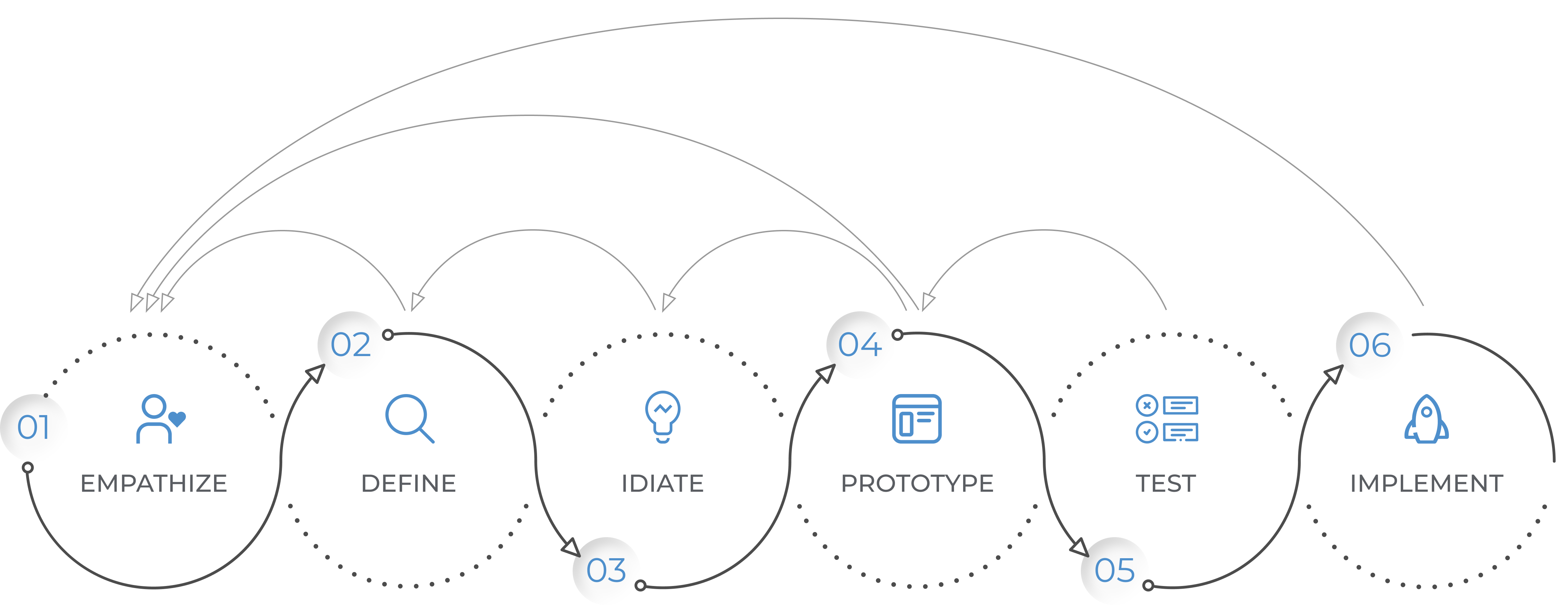
By applying design thinking to product design, we followed a UX process with the following five key phases:

1. Product Definition
1.1. Background
The toy industry is the most plastic-intensive industry in the world. 90% of the toys on the market are made of plastic. Studies show that children who chew on PVC plastic toys absorb dangerous chemicals into their bodies. (UNEP report 2014 “Valuing Plastics”).
1.2. niche market
According to the company’s market research, there is a growing demand among a niche market of people who understand the environmental issues and more than ever are seeking child-safe eco-friendly toys and prefer shopping from small businesses rather than mass producers.
1.3. PROBLEM statement
"Many people end up shopping non-recyclable mass-produced toys, despite their desire to shop for sustainable child-safe ones and support local businesses.
Because shopping from a small business's websites is sometimes confusing, challenging, time-consuming, or even unreliable, they might compromise on their sustainable material and quality principles. "
Also, some people might not recognize the value of buying sustainable toys. This is a problem because losing potential customers risks the business losing revenue and not fulfilling its mission.
1.4. Goals
- Motivate more users to shop from the company’s website by creating a pleasant user experience.
- Expand the niche market by encouraging more people to choose sustainable wooden toys over plastic ones.
- Display an outstanding level of transparency for consumers to understand if the products are sustainably and ethically produced.
- Clearly display all the materials used, including the type of certified wood and its origin and non-toxic paint and glues.
1.5. Solutions
After understanding the problem and goals, we brainstormed for several hours about fulfilling these goals. These are the possible solutions that we came up with before our research phase:
- Recognizing users’ pain points and goals and providing effective solutions by starting the research phase.
- Educating users by providing educational articles in the blog section.
- Promoting wooden toy sales by offering users the chance to contribute to planting a tree for every order placed to support the ecosystem.
- Providing content about local carpenters and motivating users to support local economies rather than mass production.
- Clearly demonstrating the brand’s Value Propositions, such as wooden material, child-safe, gender-neutral, VOC free paint, natural oil finish, and fair trade, in a way that attracts users’ attention.
2. Research
2.1. Interview
To clearly understand why people hesitate to shop from a small toy store’s website and why they find it challenging, I conducted individual in-depth interviews with five people within the company’s target market, including parents, caregivers, and individuals willing to pay a premium for wooden toys.
The interview questions were open-ended to assess target customers’ expectations and pain points about online toy shopping for kids and the overall brand objectives.
2.1.1. Interview Take Aways
The followings are the key takeaways from the interviews:
Pain Points:
- Decision fatigue caused by scrolling through thousands of options and not knowing which one to pick.
- Non-sustainable packaging and delivery methods.
Desires:
- A website that offers a curated selection of toys with straightforward navigation.
Expectations:
- Large and high-quality images from all angles
- Detailed information on material, dimentions, weight, and age group
- Customer reviews
- Information about products sustainability and ethical policies
- Shop by age
- Shop by category
- Gift wrapping service with precise details
- Reliable, quick delivery
- Free delivery
- Free return
- Customer support
2.2. Competitive Analysis
Analyzing eight similar sustainable toy websites’ features and services and their user flow helped me understand the industry standards and identify opportunities within this particular niche to exceed these standards. It also helped me in constructing a more effective Information Architecture.
Here are some of the results:
| Wood Wood Toys | Tateplota | Cozymoss | Tosla & Visla | Odin Parker | Coco Village | Kinderfeets | Bella Luna Toys | |
|---|---|---|---|---|---|---|---|---|
| Detailed product info | ||||||||
| age group filtering | ||||||||
| price filtering | ||||||||
| Company & production info | ||||||||
| educational content | ||||||||
| gift wrapping | ||||||||
| quick delivery | ||||||||
| Free Shipping | ||||||||
| Free return | ||||||||
| customer reviews | ||||||||
| social media |
2.2.1. Major Take Aways
- Company and Production Information: This is not either available or hard to find on the website. Even the ones that have a dedicated About Us page, they only share their story of how they started. There’s no solid information on who manufactures these toys and under which condition. Claims about sustainability and ethics are not backed by certificates, standards or evidences for Eco-conscious and social justice-minded consumers.
- Detailed Product info and Customer reviews: None of the website provide a full range of information on product page about material, dimension, weight, age group, certification, customer reviews, warranty, what’s in the box, assembly and care to answer all the questions in the customer’s mind. Each company provides a limited range of information which is not sufficant.
- Educational Blog: It’s important to raise awareness in such a website that non-sustainable toys will harm children and the environment they will inherit and encourage more people to move toward sustainable toys.
- Social Media: Easy access to social media links should be provided because many users prefer to go through images on Instagram or Pinterest, for example, and decide based on the design and look of the toys before checking other attributes.
- Sustainable Packaging: If people care about sustainability, sustainable packaging and delivery method is also a huge factor that none of the competitors in our research group offered that.
- Age Filtering, Price Filtering, Gift wrapping: It’s where most websites fall short and it could be the company’s competitive advantage to save more time for customers with kids who don’t have much of time in hand.
3. Analysis
3.2. Story Board
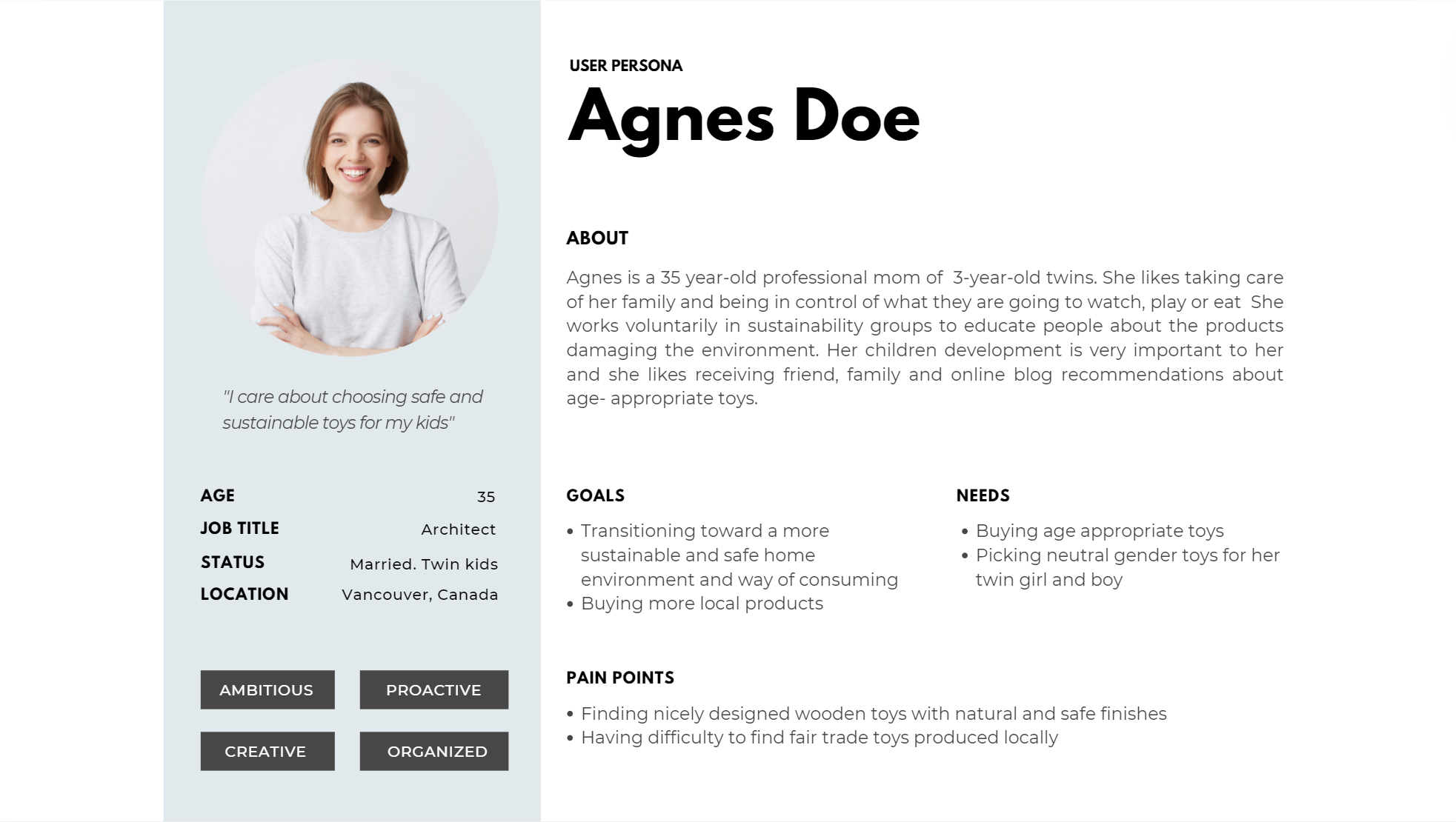
Next is exploring how Cuckoo might meet Agnes’ needs, namely buying safe wooden toys for her kids in a short period of time.
By creating a storyboard, I described and illustrated a situation that exemplified how Cuckoo helps Agnes accomplish her goals.
01.
Agnes is a busy, working mom, planning to buy her son a birthday gift for next week!
Her son enjoys playing with cars, but she is frustrated by the many plastic toys that will end up in the landfills and possibly the ocean. She wants to buy toys that are sustainable, not mass-produced, and are long-lasting.
She doesn’t have time to go shopping, and most sustainable toys online take a few weeks to arrive. She doesn’t know where to look and what to buy. She’s desperate.
02.
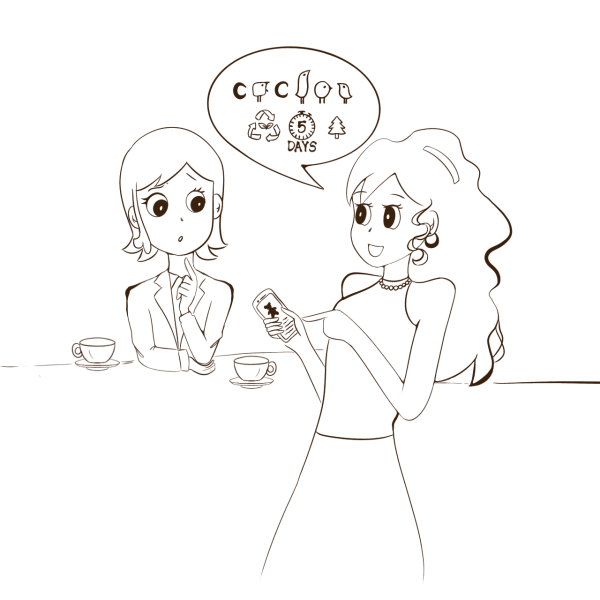
Sarah, a colleague, sees that Agnes is stressed and asks what’s happened, so Agnes explains.
Smiling, Sarah says that she ordered an excellent gift for her nephew last week from a website that sells sustainable, child-safe, handmade wooden toys, and it arrived in five days.
Sarah tells Agnes that these toys are made by local carpenters, supporting local small businesses, and each toy contributes to planting trees. Sarah shows Agnes Cuckoo’s website on her phone.
Agnes excitedly says she prefers to check it on her computer. Sarah tells Agnes that the website has high-resolution photos from all angles, a 3D model, and a video for each toy to better understand its size and weight. You can also filter toys by category, color, price, or even age.
03.
At home, Agnes jumps behind her computer and begins scrolling the website. The minimal design and beautiful toys are appealing. Agnes filters toys by age and price, and in less than five minutes, she has added a beautiful truck to her cart with the option of adding customizable gift wrapping and a message for free. It’s a great time-saving option.
Noticing a 50% discount on the website for adding a second item, she gets encouraged to buy something for her daughter, so she doesn’t feel left out at the party.
Her daughter loves animals, especially bears. In the animal category, she finds a beautiful polar bear family, and after checking all the details, reviews, and photos, she adds it to the cart and checks out.
The confirmation message states that free delivery for orders above $50 is within 3-5 business days. Fantastic! It’s done!
04.
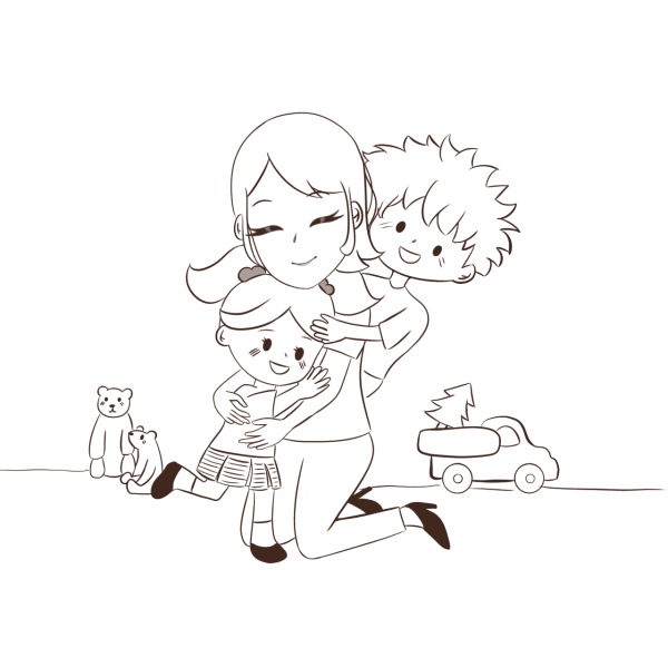
It’s birthday day! She received the gifts two days before, already gift-wrapped. She hands them to her children. They open the gifts and absolutely love them.
She’s delighted to make them happy while protecting the environment for their future and helping local carpenters. It saved her a lot of time and solved her problem efficiently.

3.3. USER FLOW
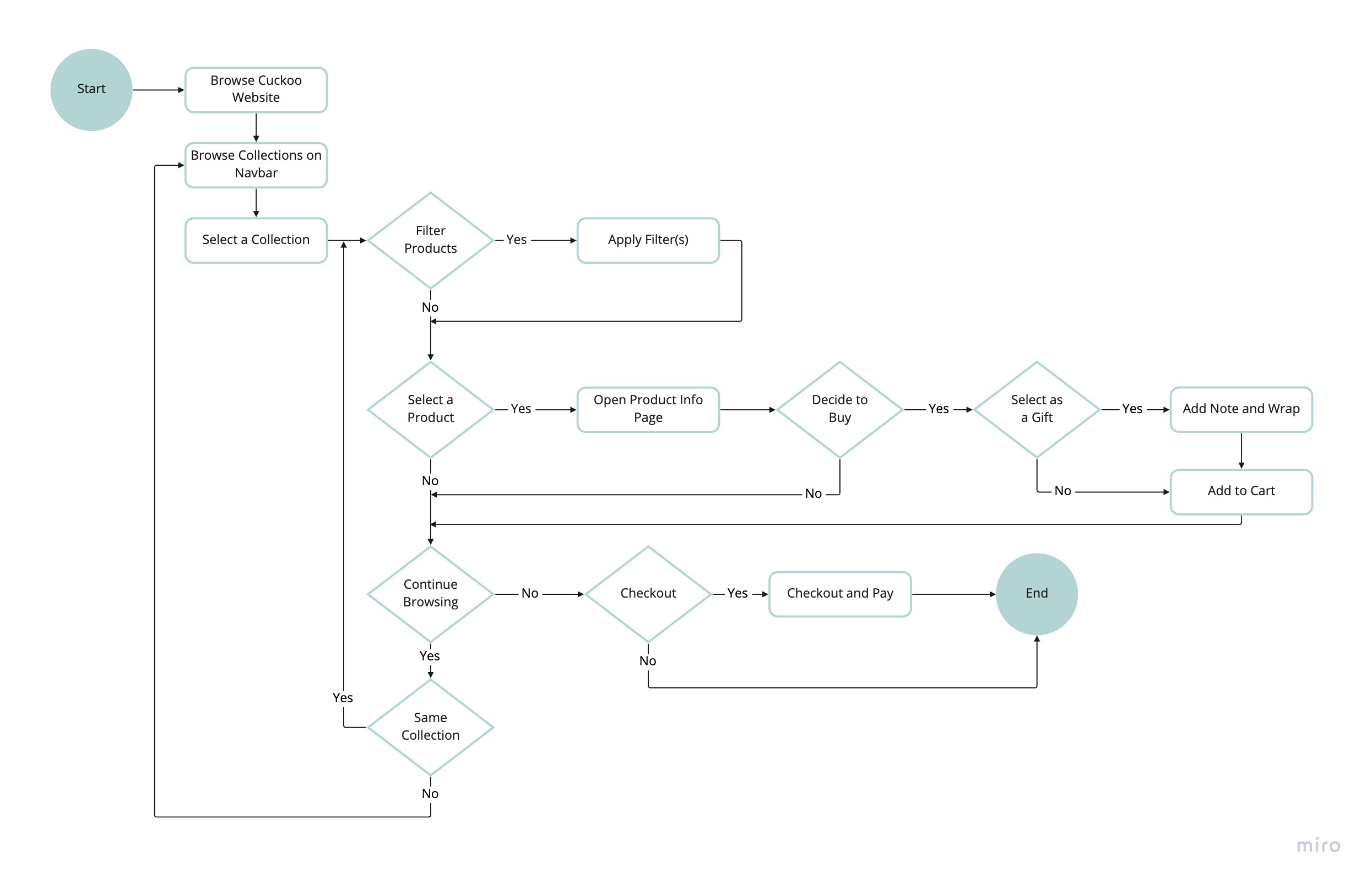
Considering Agnes’ needs and the company’s goals, I constructed a user flow that describes the pathways user might take while purchasing an item. This process helped me in
- Identifying the key screens and call to actions.
- Understanding different ways users can interact with the website.
- analyzing navigation by user goals.
3.4. Site Map (IA)
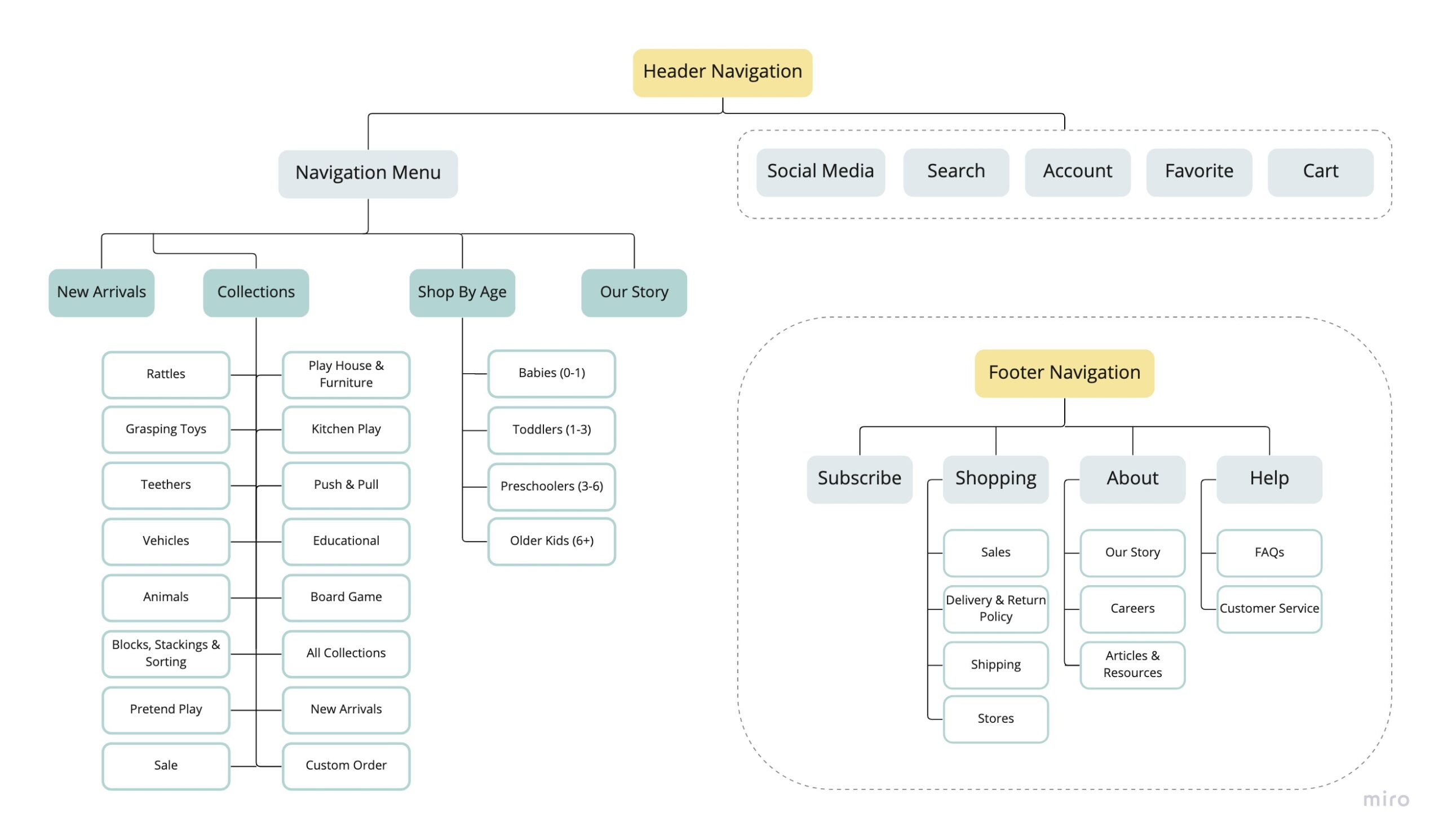
To construct the site map, I needed to plan out the location of key screens and the main features and how they related to each other within the website.
Althought user persona could help me prioritize the features, it wasn’t the only tool; the needs and goals of the business itself was also considered. Prioritizing the key screens, on the other hand, was drawn from the User Flow.
4. Design
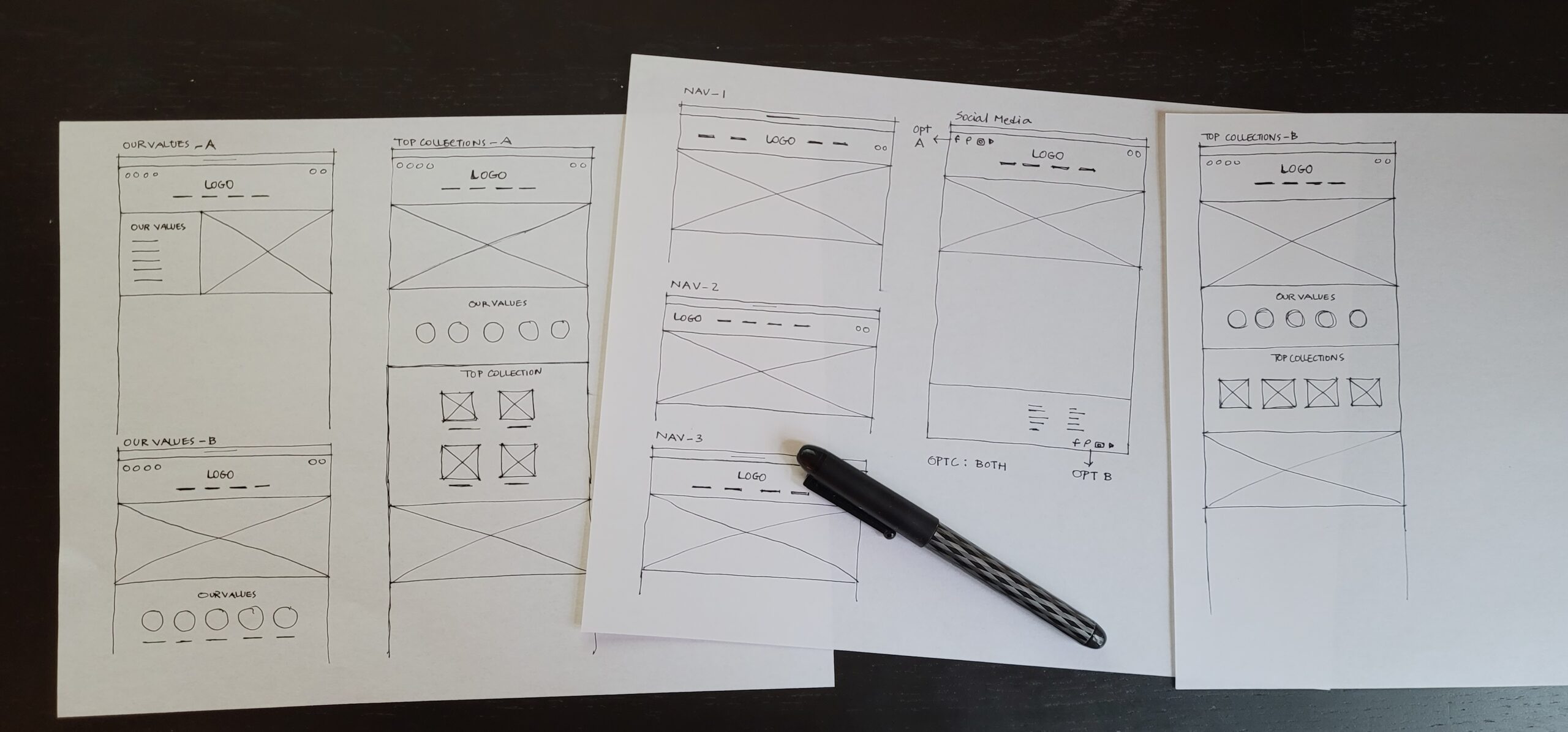
4.1. Sketches
I started the design stage sketching out layout ideas utilizing all the information and insight gained from previous steps.
These low-fidelity wireframes were a quick and efficient method for developing visual hierarchy and planning out key screens to help users buy their favorite wooden toys.
It also helped to observe the integration of various elements of the website.
4.2. Wireframes
By creating mid-fidelity wireframes using Figma, sketches were transformed to a digital form prepared for the usability testing. Designing wireframes in grayscale, helped us remain focused on functions and features.
The wireframes went through a couple of rounds of iteration driven by the initial rounds of usability testing until these frames were developed.
Please hold your mouse on each info Icon shown in orange circles to read more about the major parts of the design, which are the solutions to users’ needs and challenges.
We placed the social media icons at the header because we recognize the significance of social media in promoting sustainable products, such as wooden toys. Given that people frequently browse social media for inspiration and ideas, especially when it comes to selecting visually appealing wooden toys, it was important for us to create a community of like-minded individuals who care about sustainable and safe toys. By placing the icons at the header, we enable users to effortlessly follow us and stay updated on our latest offerings, thereby fostering a sense of community among our customers.
The search box at the header is an essential feature for any e-commerce website. It helps users quickly find what they are looking for without having to navigate through multiple pages. We wanted to ensure that our users have a seamless shopping experience, and the search box plays a crucial role in achieving that.
In the header design, we have placed the logo and navigation menu at the center, with a focus on symmetry to create a well-balanced and visually pleasing layout. The logo acts as a central point, drawing the user’s attention towards the brand. Moreover, by placing the navigation menu right beneath the logo and following the principle of “above the fold” design, we have made it effortless for users to access the primary sections of the website without having to scroll or search for them, thus enhancing user experience.
In the hero image section, we applied the principle of the golden ratio to create a sense of visual balance and flow.
Additionally, by placing the CTA button under the text, we ensure that users see the key message before being prompted to take action. This helps to increase the chances of users engaging with the CTA and exploring our products further.
Our values section is an important part of our website because it communicates our mission and values to our users. We believe in transparency and want our users to know what we stand for. By showcasing our values, we hope to attract like-minded individuals who share our passion for sustainable living.
The top collections section is a convenient way for users to browse our most popular products. We carefully curated these collections based on our market research and user feedback, ensuring that we showcase the products that our users are most interested in.
Supporting local carpenters is a core part of our mission, and we wanted to make sure that it was prominently featured on our homepage. By showcasing our local carpenters, we hope to encourage users to support small businesses and promote sustainable economies.
Our plant a tree section is a unique feature that sets us apart from other e-commerce websites. We wanted to give our users the opportunity to contribute to environmental sustainability while shopping for sustainable wooden toys. By planting a tree for every order placed, we hope to make a positive impact on the environment and inspire our users to make sustainable choices.
Our best sellers section is another convenient way for users to browse our most popular products. We update this section regularly based on our sales data, ensuring that our users are always up-to-date on the latest trends.
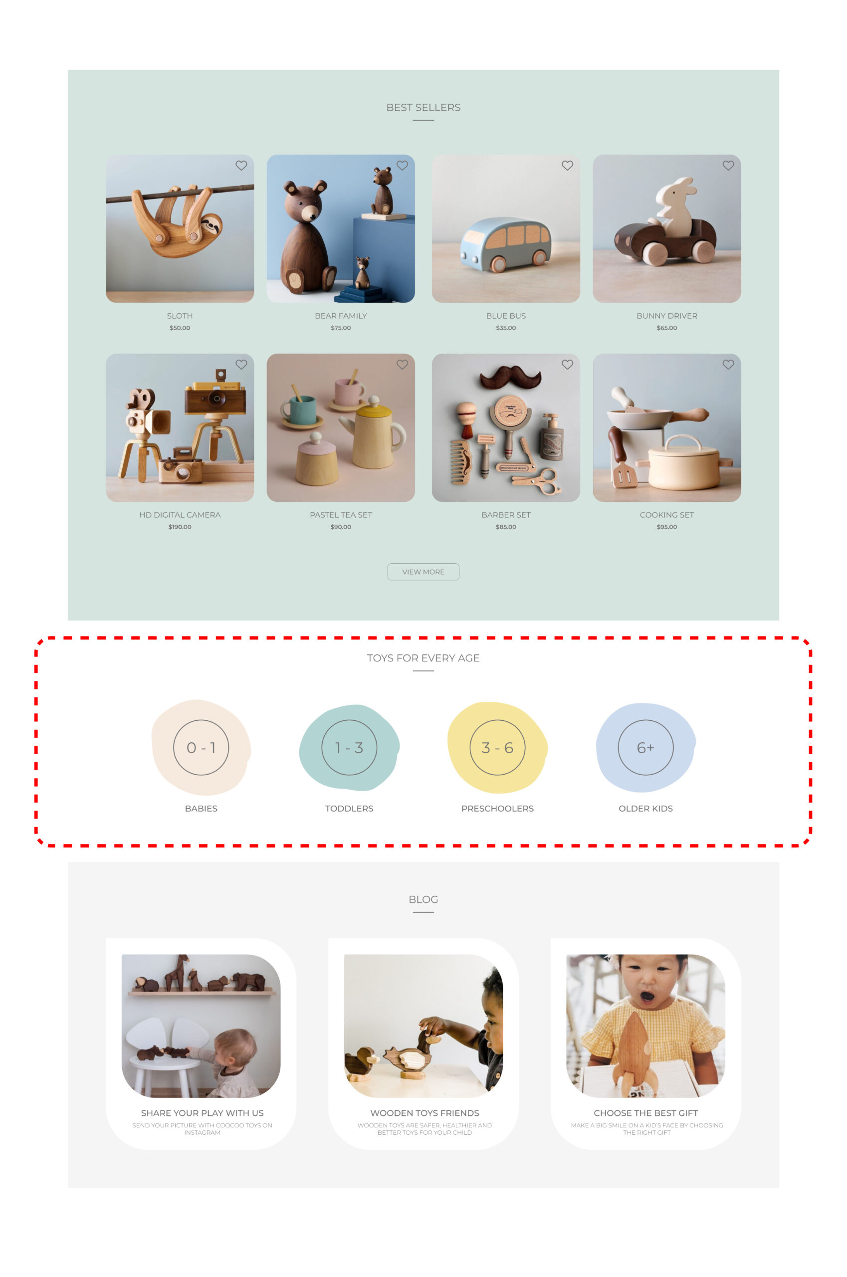
Categorizing toys by age is an important feature for our users, as it helps them quickly find the right toys for their children’s developmental stage. We carefully categorized our toys based on safety and developmental guidelines, ensuring that our users can shop with confidence.
Our blog section is an essential part of our website, as it provides valuable information and resources for our users. We understand that sustainability can be a complex topic, and we want to educate our users and provide them with the tools they need to make informed decisions.
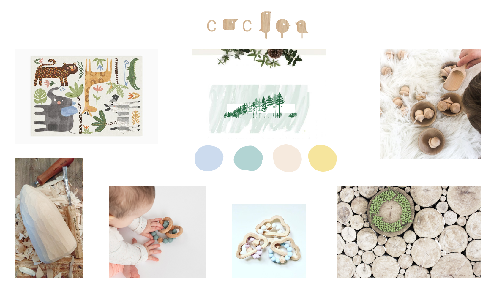
4.3. Moodboard
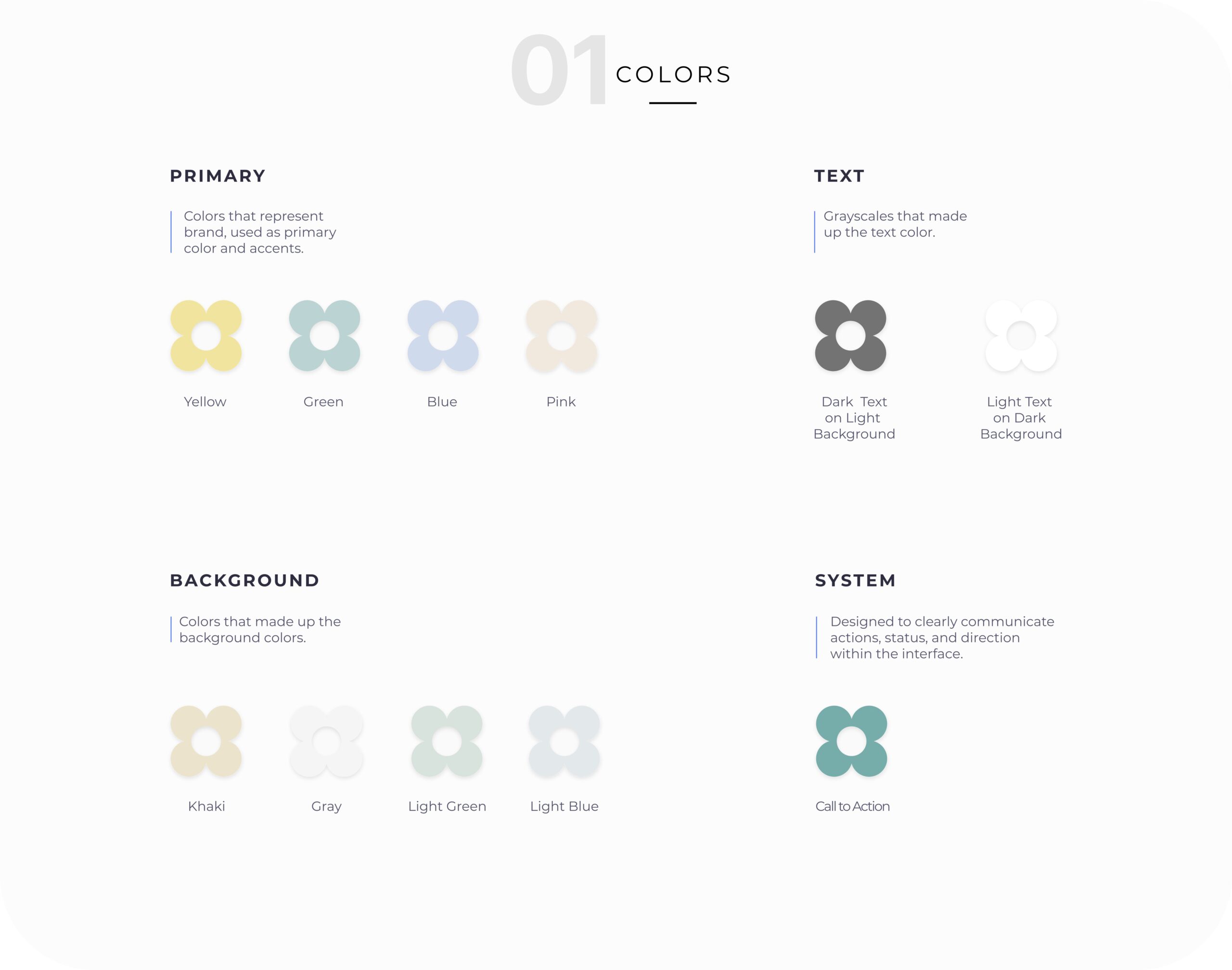
While creating the user interface, I paid special attention to the persona’s needs and brand attributes which are safety, sustainability and natural color.
4.4. UI Kit
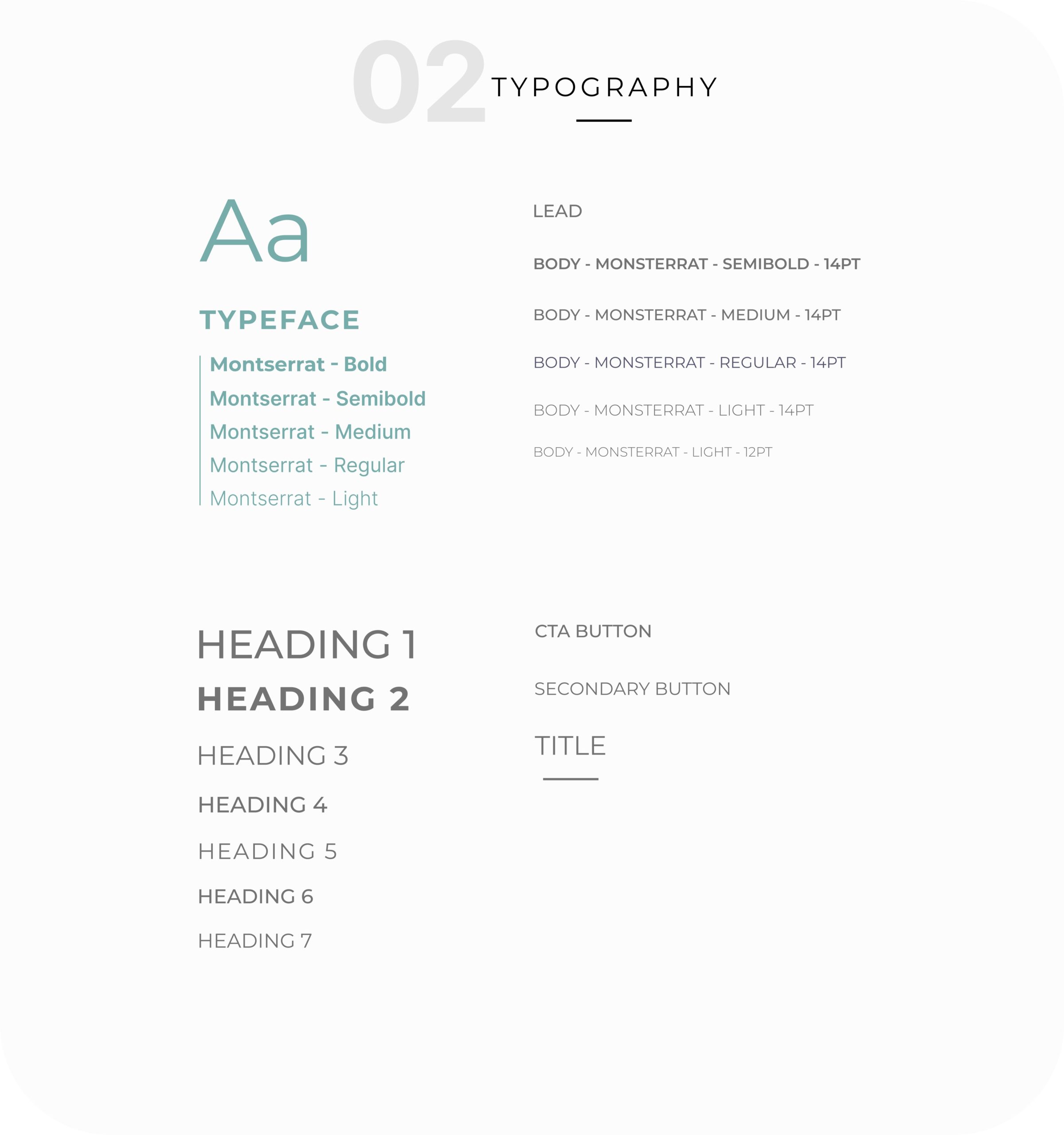
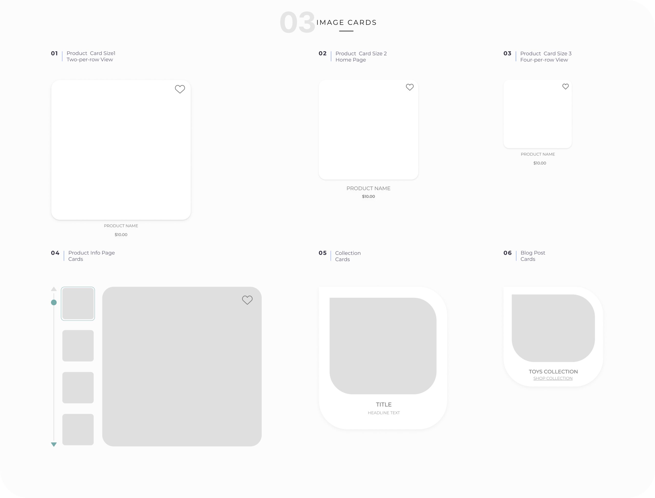
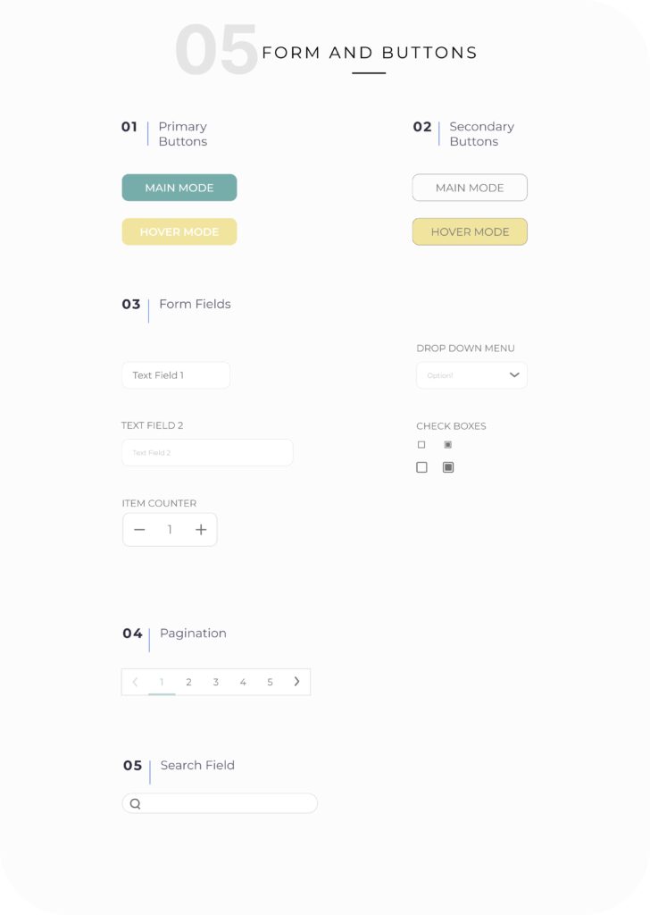
Finally, having applied the Cuckoo layouts defined in the mid-fidelity wireframes, I created a UI Kit. This is a living document that can serve as a resource, ensuring that the visual design remains consistent as the website is further developed.
- Having an aesthetically pleasing and minimal design to create a delightful shopping experience and emphasize on high quality and sleek design of the toys.
- Applying soft colors, minimal font styles, flat patterns, and maximizing negative space to avoid cluttered and overwhelming design to follow the minimal design.
- Simplifying interfaces by restricting features and element that does not support user needs.
5. Validation
5.1. Usability Testing
To reveal the possible usability problems and evaluate the design, I did a testing round of our prototype. I assigned 4 tasks to 10 users as shown below:
- Find and add your favorite toy to the wish list
- Buy a toy from a specific collection with and without filtering
- Buy a toy for a specific age-range
- Buy a toy as a gift
Then I asked users to complete the tasks using the prototype. The main findings and iterations are shown below:
FINDING
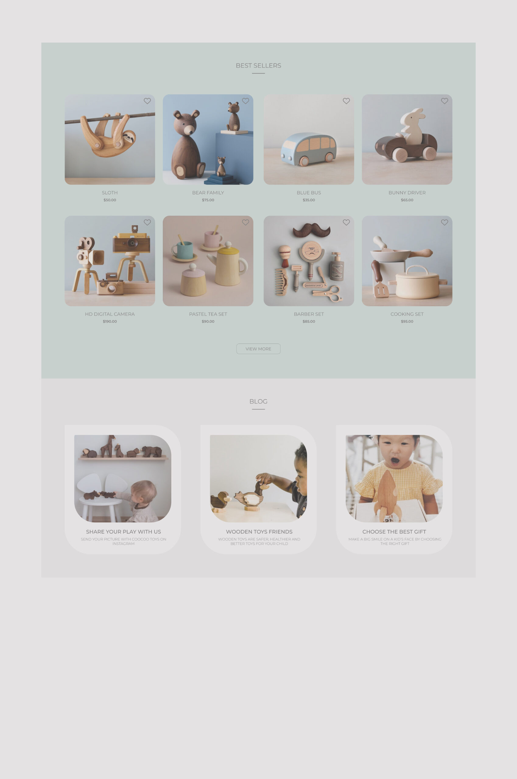
Users indicated that categorizing toys based on age is really helpful which is rarely available on the competitors’ websites. However, shopping toys in a specific age range was only available through navigation bar or filtering.
They mentioned that they might miss that when they are scrolling through the home page for the first time. So, we added a dedicated section on home page to shed light on it in order to answer one of users’ needs.
FINDING
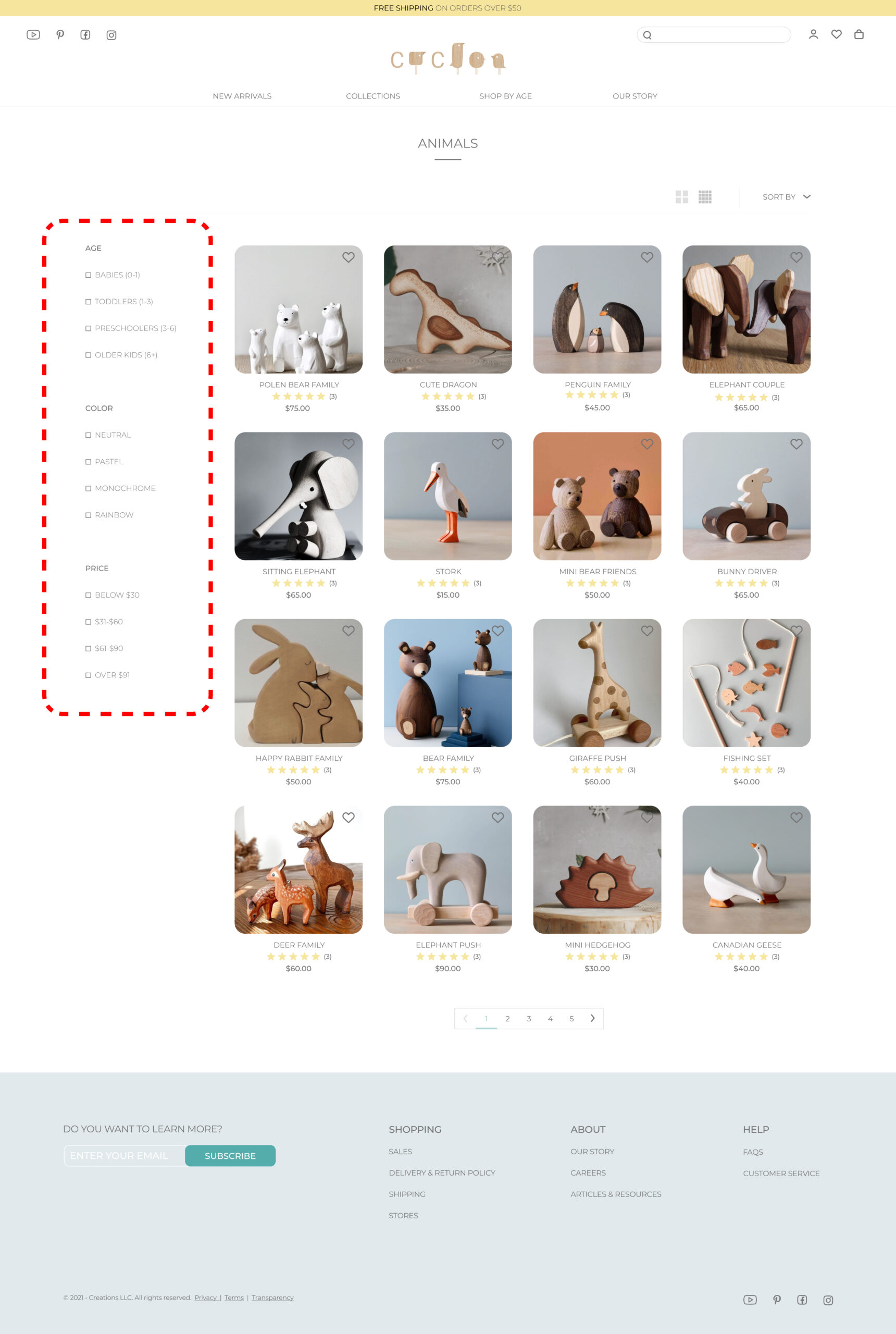
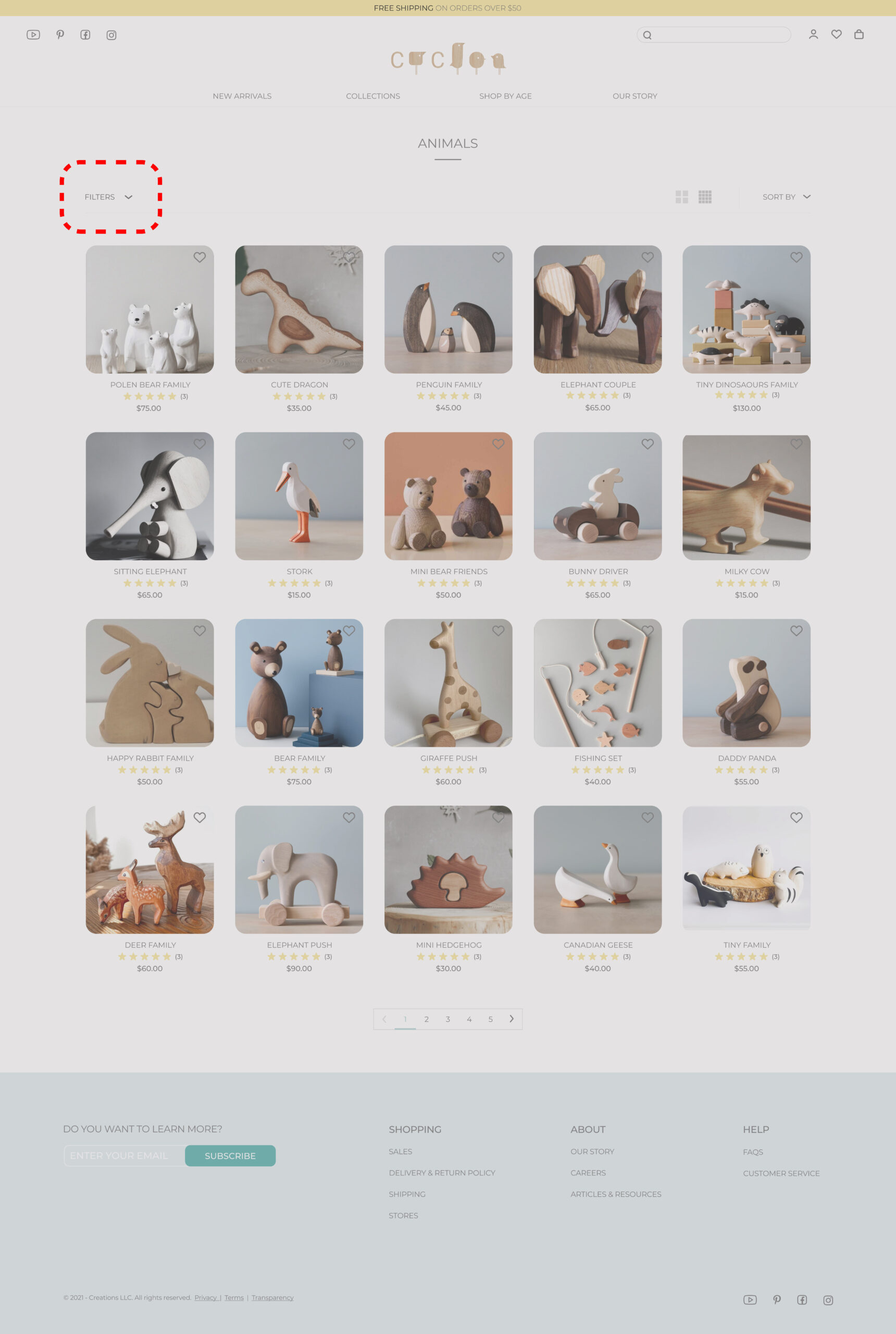
The filtering option was designed as a drop-down format that can be hidden or displayed by users when they want.
Through the user test, the participants have a problem remembering which filters are applied and they said they prefer to see it during the browsing products.
Therefore, the filtering changed to fully display.
FINDING
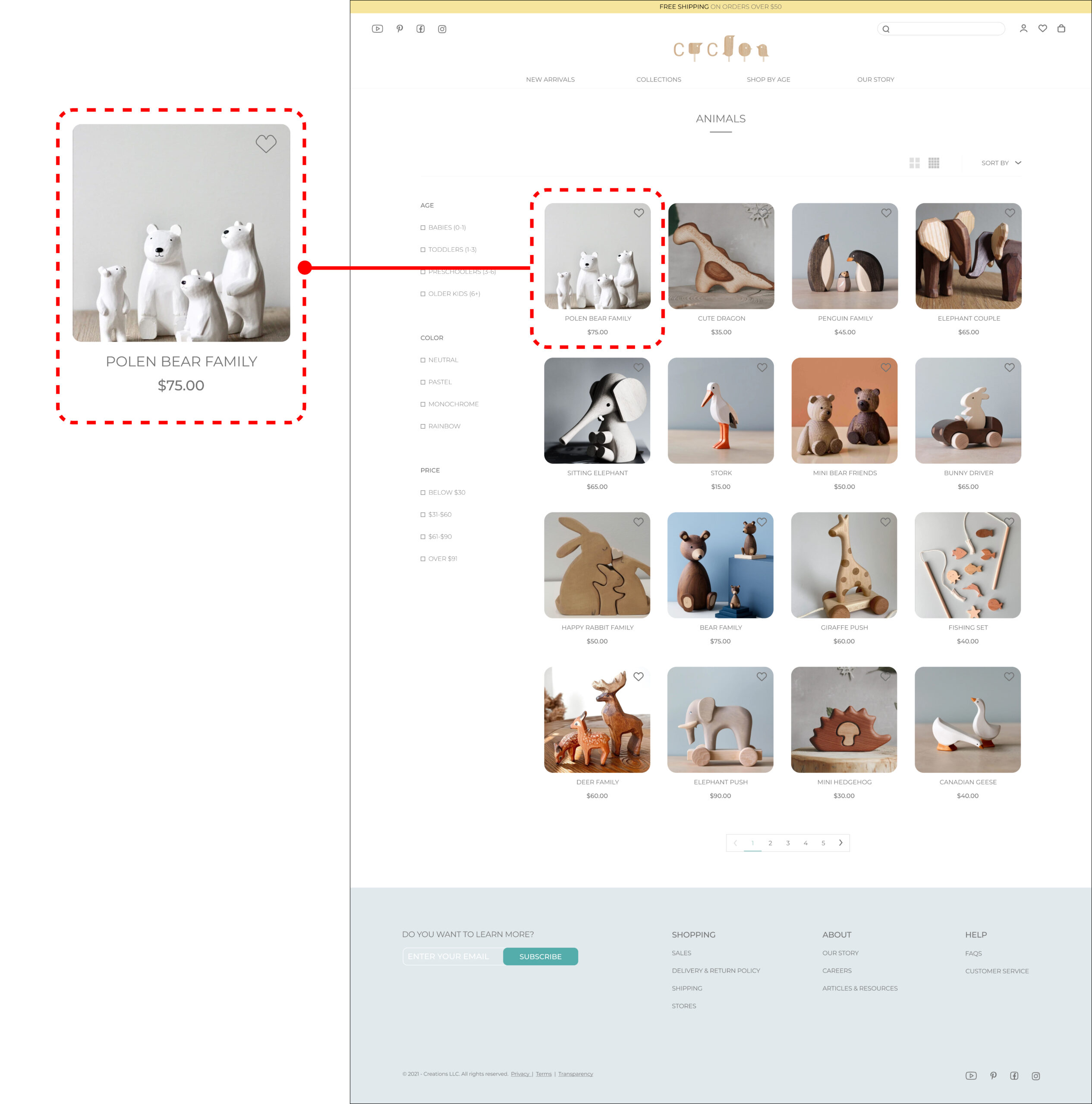
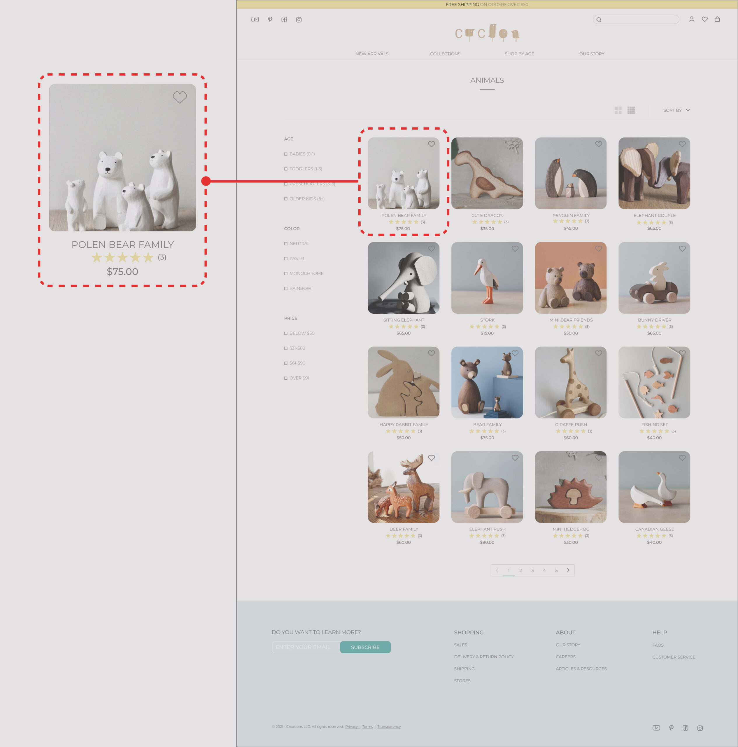
Customer review is a remarkable factor in users’ behavior. Through the project research, I find it as a competitive advantage. It is designed under each toy image the rank and the numbers of the råeview.
Through the usability test, participants mentioned that the main factor that encourages them to click on an item to see it more is the image and the price and they do not pay attention to reviews.
In addition, since the Cuckoo is a local store, many of the products do not have reviews.
Therefore to eliminate the non-essential information and follow the business goals and design the review is eliminated on the collection page.
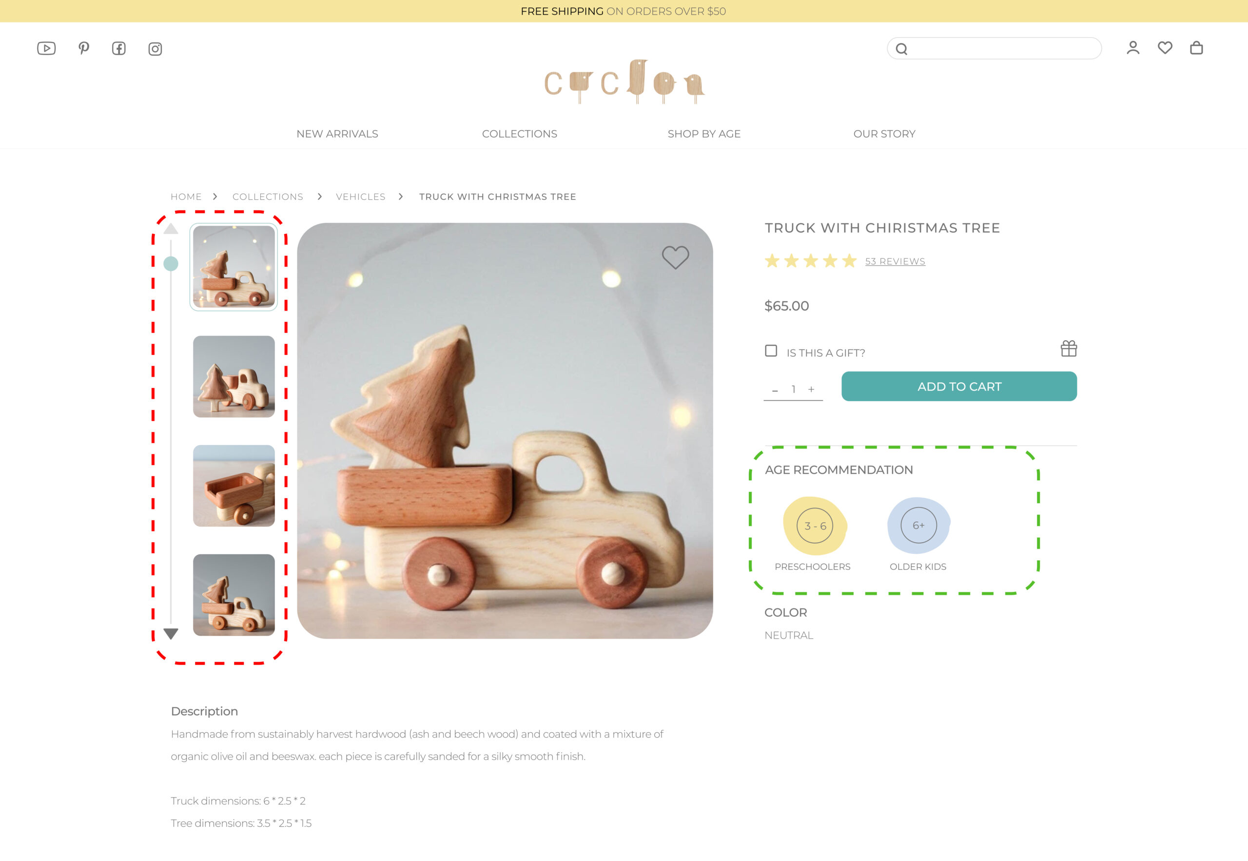
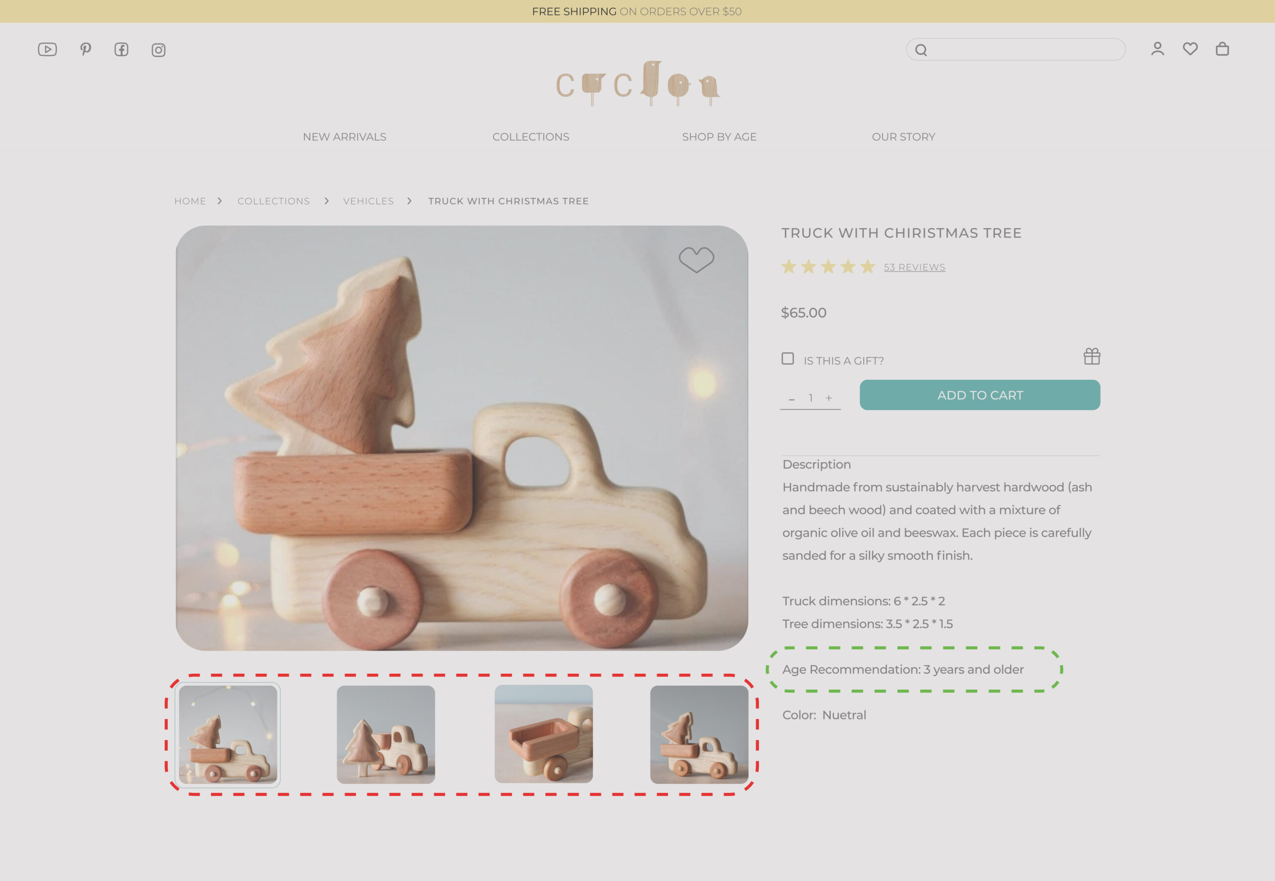
FINDING
There is a discerption section on the product page that includes some information such as dimension, age, and color.
It is mentioned by participants that the age recommendation on the product page is not visible and they should read a lot to find it.
After some iteration in this section, the final design is shown in the picture. In redesigning this section I consider
Keeping consistency with the main page
Highlighted under the CTA which attract the attention
Designing clickable that users can easily go to desire age categories.
FINAL PRODUCT
High Fidelity Wireframes
The insights from usability testing were used to update the wireframes in ways that addressed the points of frustration, confusion and hesitation with the added features. The major changes for improving usability are annotated below
Reflections
What I have learned from this project
As I reflect on this project, I am grateful for the valuable insights and skills that I have gained. Through this process, I have gained a deeper understanding of the importance of user-centered design and how it can enhance the overall user experience.
UI Design and Design System
One of the most significant takeaways was the importance of developing a robust UI design and design system, including components, which ensured maintaining consistent design language across the entire project. This not only ensured the brand’s cohesive image but also streamlined the design process, improving productivity and team collaboration. I learned the value of comprehensive resources and infrastructure for team members, ensuring consistent design in less time. Effective communication and collaboration in developing a design system and UI kit played a crucial role in the success of the project.
Test, improve and test all over again
Another key learning was the importance of iterative testing and improvement in the design process. While it may be tempting to present a polished and high-fidelity prototype to users, conducting usability tests on medium-fidelity prototypes allowed us to receive more critical feedback from users. Users were more confident to give highly-critical feedback on an incomplete prototype, which helped us avoid potential design pitfalls and save time and resources down the road. This experience reinforced the importance of testing, improving, and testing again, and provided valuable insights into user needs, preferences, and pain points. It showed how early user feedback can be valuable in creating a more effective and intuitive design.
What I can do next
After completing this project, I’ve identified several areas that I need to focus on for future projects.
One priority is to evaluate website designs using various testing methods, such as Maze software.
Additionally, I recognize the significance of accessibility, and plan to create alternative modes with higher contrast colors to ensure that the website is accessible to all users, without compromising its minimalistic and soft tone.
Moreover, I intend to enhance my design skills by exploring advanced prototyping tools and methods that can help me create more sophisticated and interactive prototypes.
Ultimately, I will continue to update my knowledge of the latest design trends and technologies, with a particular focus on usability testing and accessibility. I believe that by incorporating more rigorous testing methods and analysis, I can design more inclusive and effective solutions that cater to a wider range of users and meet the needs of all users.
What I would do differently
As I reflect on the project, I recognize that there were areas where I could have improved my approach, particularly regarding usability testing. In hindsight, I would have devoted more time and effort to the first usability test on low-fidelity prototypes. This would have allowed us to receive feedback earlier, make changes more efficiently, and put less pressure on users, ultimately streamlining the design process. In future projects, I plan to prioritize testing and allocate sufficient time and resources for usability testing at every stage of the design process.
