Organic Grocery Market Website Redesign

About Sprouts

Sprouts Farmers Market,a prominent US supermarket chain, boasts over 340 stores in 23 states. Renowned for its commitment to organic quality products, sustainability, zero waste, health and wellness initiatives and charitable activities, Sprouts offers a diverse array of natural and organic products. 

From fresh produce and bulk foods to vitamins, supplements, packaged groceries, meat and seafood, deli, baked goods, dairy products, frozen foods, natural body care and household items, the grocer’s dedication to quality sets it apart in the market.

project overview

Despite Sprouts’ success in providing high-quality products, it has faced challenges in ensuring competence in delivering a seamless and efficient online shopping experience for customers. Due to fundamental issues in homepage navigation and information architecture, the website finds it challenging to compete with rival grocery stores online.

Motivated by this, our team embarked on a concept project to identify and address these gaps and bottlenecks, aiming to provide improved solutions that meet users’ needs and drive increased online revenue for the business. 

This project aimed to position Sprouts competitively among other grocery stores in the digital landscape.


Project Type

Ecommerce Website

Redesign


My Role
  • UX Designer
  • UI/Interaction Designer

Team
  • 3 UX Designers
  • 1 UI Designer

Duration

6 Weeks


Softwares
  • Figma
  • Miro
  • Kardsort
  • Photoshop

Target Device

Desktop


Deliverables

Website Prototype

My contribution

As a member of a dynamic team consisting of three UX researchers from the US and a solo UI/Interaction designer, I played a pivotal role in the redesign of Sprouts’ website. Operating in a remote setting during the pandemic, we utilized online collaboration tools such as Zoom, Miro, Telegram, Google Docs, and Google Drive to ensure effective communication and idea sharing.

UNDERSTANDING THE BUSINESS​

In order to be able to redesign this business’s website I needed to understand the history and values of the business better. Since I didn’t have access to the stakeholders, I used the public information with the help of Google and Wikipedia!

History
  • Family Business
  • Grew from a fresh fruit stand in 1943 into a handful of open-air farmers markets and later into a beloved community grocery store. In 2002 Sprouts Farmers Market was founded.
Values
  • Health and wellness:

     In 2015, Sprouts founded the Healthy Communities Foundation, which supports local health and wellness related causes.

  • Sustainability:

     Sprouts operates with a focus on:

  • Environment
  • Product quality
  • Supply chain transparency
  • Team members
  • Local communities
  • Zero Waste diversion program: Provides food to those in need, feed for animals, and nutrients for agricultural soil.

Challenges

The primary challenges faced during this redesign focused on key areas of the Sprouts website:

  • Confusing Terminology: Inconsistencies in terminology throughout the website led to user confusion.
  • Disorganized UI Design: The existing UI suffered from disorganization, resulting in a less efficient user experience.
  • Non-logical Categorization: Products and services lacked logical categorization, contributing to user frustration.

Redesign Goal

Our overarching goal for the redesign was twofold:

  1. Enhance User Experience: Address the identified issues to create a smoother and faster online shopping experience for Sprouts’ customers.
  2. Improve Business Metrics: Focus on enhancing user conversion and retention rates to positively impact Sprouts’ online revenue.

By aligning our efforts with these goals, we aimed to position Sprouts as a competitive force in the online grocery market, offering an intuitive and satisfying digital shopping experience.
Design Thinking Approach

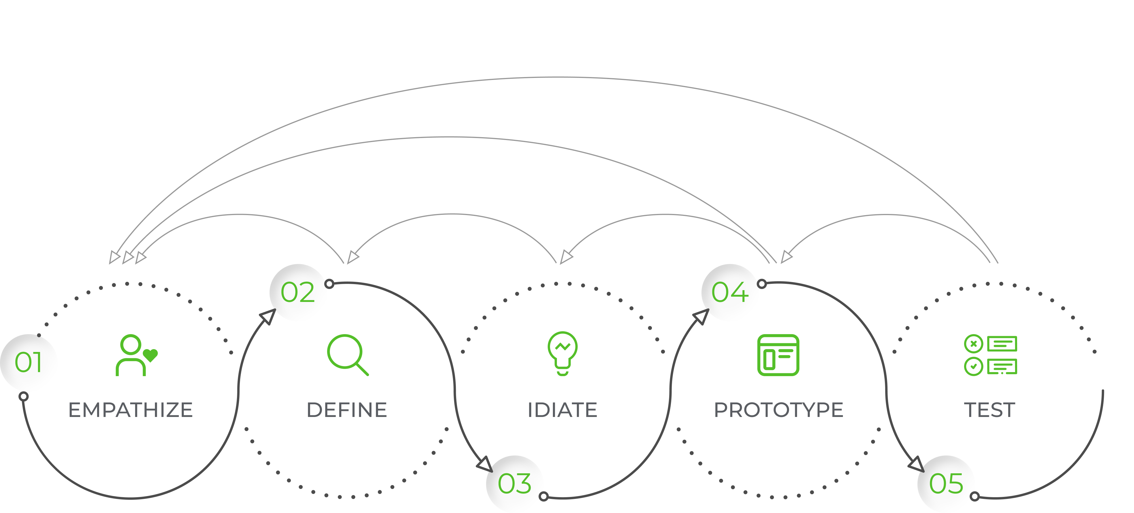
In this study, we followed the d.school five-step design thinking approach, a methodology that prioritizes user-centric solutions and iterative problem-solving.
  • User interview //
  • Usability testing//
  • Understanding the Busines//
  • Heuristic Evaluation
  • Card Sorting
  • Affinity Diagram
  • Persona
  • Scenario
  • Storyboard
  • User journey map
  • Empathy Map
  • Problem Statement
  • Mind map
  • Competitive Analysis
  • Card Sorting
  • Brainstorm
  • Sketches
  • User Flow//
  • Information Architecture
  • Site Map//
  • Wireframes
  • Moodboard
  • Design System
  • UI Kit
  • Prototype
  • User Testing
  • Iterations
  • High Fidelity Prototype

1. Empathize

In the Empathize phase, our goal was to understand users’ experiences with Sprouts Farmers Market’s current online platform. 

Through user interviews, usability testing, and card sorting, we delved deep into their perspectives, uncovering insights crucial for a user-centric redesign. Each activity provided unique perspectives, setting the stage for targeted improvements in the subsequent design phases.

1.1. Usability Testing and INTERVIEW

Usability testing:

To learn more about the users and uncover their pain points while online shopping at current Sprouts website, we gave 16 individuals 2 tasks to complete:

  • To find a specific item, Chobani Lime Yogurt, without using the search box.  We observed their ways of navigation and measured the task completion time. 
  • We asked them to browse the website and select an item for delivery to their address and add it to cart and continue to the last step of the checkout. We took notes of places where we detected confusion, being lost and frustrations. 

Interview:

After finishing the requested tasks, we asked them to talk about their experience and explain which parts they felt troubled and why.

Here are the most common feedbacks about the website:

1.2. Card sort

In this phase, our goal was to iteratively refine the information architecture of the Sprouts Farmers Market website through an open card sort. 

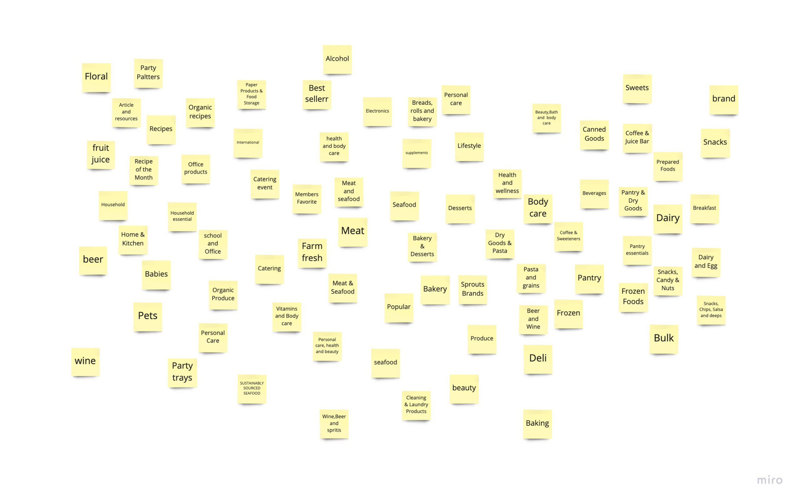
We meticulously examined every product and item on the site, creating a sticky note for each one that seemed misplaced under the current categories. This collection of user-generated sticky notes formed the basis for an open card sorting exercise involving 15 users through Kardsort.com. Users were tasked with naming the category they deemed most appropriate for each item. 

However, the results were not as expected, revealing unexpected categorizations and naming conventions. Recognizing the need for a swift adjustment, we decided to pivot to a closed card sort, examining how competitors named their main categories to inspire a more intuitive and user-friendly classification system.

This iterative process, guided by user feedback and industry best practices, significantly contributed to achieving a better information architecture, ensuring an improved user experience on the website.

2. Define

In the Define chapter, our mission was to distill user insights from the Empathize phase into a comprehensive understanding of challenges and opportunities. Activities like Heuristic Evaluation and Competitive Analysis provided a detailed examination of existing designs, shedding light on issues related to navigation and product categories. 

Simultaneously, crafting detailed Personas and developing Scenarios enriched our perspective, vividly portraying user interactions with the Sprouts website. 

As part of this phase, we strategically employed the Affinity Diagram to visually organize our findings, identifying patterns and gaining crucial insights. 

This collective understanding served as the cornerstone for crafting a well-defined problem statement, propelling us seamlessly into the subsequent stages of ideation and solution generation in our holistic redesign journey.

2.1. Heuristic Evaluation

In the process of redesigning the Sprouts website, a heuristic evaluation was conducted to assess its usability and identify potential areas for improvement. This evaluation involved applying established usability principles and guidelines to analyze the current user experience of the website. By conducting this evaluation, we aimed to gain insights into the website’s strengths, weaknesses, and opportunities for enhancement.

Methodology

The heuristic evaluation was conducted by a team of three UX researchers undertaking the following steps  to explore and evaluate Sprouts website:

1. Familiarization
  • The team extensively explored the existing Sprouts website to gain a comprehensive understanding of its structure, content, and functionality.
  • Various user scenarios, such as searching for specific products, browsing categories, and completing purchases, were simulated to immerse in the user journey.
2. Heuristic Application
  • Established usability heuristics, such as Nielsen’s 10 heuristics, were utilized as a framework to evaluate the website.
  • Each heuristic principle was carefully examined and applied to assess the design and functionality of Sprouts website.
3. Evaluation Findings
  • As the evaluation progressed, the team documented notable findings, usability issues, and areas of improvement.
  • The evaluation focused on identifying instances where the website deviated from the usability principles and guidelines.
4. Severity Rating
  • Each identified usability issue was assigned a severity rating based on its potential impact on the user experience.
  • The severity rating considered factors such as the frequency of occurrence, the magnitude of impact, and the user’s ability to recover from the issue.
5. Recommendations
  • Based on the evaluation findings, the team generated a set of actionable recommendations for improving the user experience of the Sprouts website.
  • Recommendations were prioritized based on the severity of the issues, potential impact on user satisfaction, and alignment with the project goals.

2.2. Competitive Analysis

In our competitive analysis, we closely examined menus and navigation structures used by industry leaders in grocery retail. This exploration allowed us to identify industry trends, user-friendly categorization methods, and optimal menu structures that contribute to an enhanced online shopping experience. 

Integrating these findings into our redesign approach, we aimed to not only align Sprouts Farmers Market with industry best practices but also surpass user expectations by implementing a more intuitive and efficient IA.

2.3. Affinity diagram

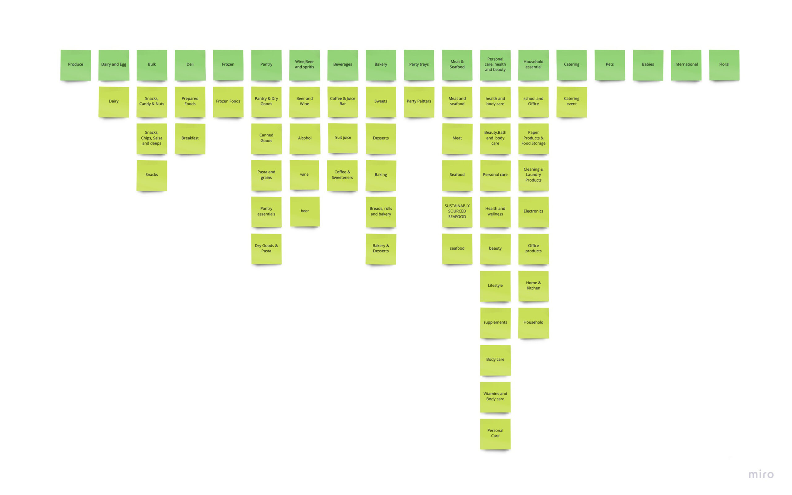
Through rigorous card sorting exercises and an in-depth competitive analysis, we identified numerous product categories within the Sprouts website. 

The Affinity Diagram served as our strategic tool, allowing us meticulously organize these diverse categories, weaving together the threads of user preferences and industry benchmarks. 
Before After

This collaborative synthesis not only unveiled valuable user preferences but also paved the way for a refined information architecture, elevating the overall user experience on the Sprouts Farmers Market website.

2.4. problem statement

At Sprouts Farmers Market, the website design poses challenges encompassing aesthetics, user flow, and the overall shopping journey. Users grapple with unclear pathways, inconsistent product categorization, and a complex checkout experience, leading to a decline in satisfaction. 

Our central design challenge is to holistically revamp the website experience. While prioritizing the refinement of product categories and navigation, our goal is to craft an intuitive, visually pleasing, and streamlined online shopping platform that harmonizes with user expectations and furthers Sprouts’ strategic objectives.

3. Ideate

In the Ideate phase of reshaping the Sprouts Farmers Market website, our design team taps into insights from the Empathize and Define phases to ignite a creative exploration. As we envision the future of Sprouts’ online presence, we engage in dynamic brainstorming sessions, sketching endeavors, and the meticulous development of task flows. This phase also witnesses the refinement of the site map, ensuring it aligns seamlessly with inventive concepts. Focused on addressing Sprouts’ unique challenges, the Ideate stage is a hub of creativity, laying the foundation for an intuitive and visually appealing redesign that enhances the overall user experience.

3.1. Task Flow

In the diagram shown below I demonstrated the main task flow on Sprouts website which is shopping through ‘Departments’ and their subcategories.

In this flow user takes the following steps:

  1. User chooses a ‘Department’
  2. User can narrow down the products through ‘Filters/Sort’ if he/she decides.
  3. User can choose the number of products through the quick  “Add to cart/list button’ on each item or open the ‘Product details page’ and after reviewing the information decide to do so or not.
  4. User can continue this process on the same departments and/or other departments until he/she decides to checkout.
  5. User can end this flow and exit, at any point that he/she decides. 

3.2. Site Map

After several rounds of going through ‘Departments’ and their subcategories and reviewing the products under those categories, and combining the results of Affinity Diagram, Competitive Analysis and Card sorting and multiple rounds of usability testing and iterations, here is the result of Sprouts site map and its hierarchy:

The main changes compared to the old version of Sprouts are:

  1. Articles and resources is eliminated from the main menu and it is moved into a dedicated section on the main page and Footer. Users believe this item is not the first thing that they need to have access to on a grocery store’s website menu.
  2. ‘Shop Now’ menu is eliminated from the main menu. Rather it’s added on top of the page on the Top Nav in a more clear way as Pickup/Delivery with the options to choose the address and time to avoid errors and confusion for users.
  3. All the departments under the ‘Department Menu’ are revised and reorganized in a more intuitive and  familiar way for users.
  4. All the ‘Ways to Save’ are listed under a more familiar term as ‘Sale & Savings’ and Weekly Ads and Free Samples are also listed under this menu.
  5. Receipe menu is devided into subcategorie for an easier navigation. 

3.3. Sketches

4. Prototype

In the Prototype phase of revitalizing the Sprouts Farmers Market website, our design journey takes a decisive leap from ideation to tangible realization. Armed with insights gleaned during the Empathize, Define, and Ideate phases, we shift our focus to crafting interactive representations of our envisioned solutions. This pivotal stage involves the meticulous development of high-fidelity prototypes that breathe life into the redesigned Sprouts online experience. From low-fidelity sketches to dynamic interactive mockups, this phase is the bridge that transforms creative concepts into testable, user-centric designs. Join us as we delve into the intricacies of our prototype development, unveiling a preview of the Sprouts website’s future and setting the stage for crucial user testing and refinement.

4.1. high-fidelity prototype

DEMO VIDEO – PART 1:


Home Page Exploration:

  • A comprehensive exploration of the redesigned Sprouts Farmers Market home page.
  • Emphasis on achieving a seamless and user-friendly design.

Multiple Navigation Channels Including:
  • The top navigation menu.
  • Department categories on the home page.
  • Featured and sale sections in the homepage for a dynamic shopping experience.
  • The side menu within department pages.
  • Subdepartments sections within the departments page.

Information Architecture Improvement:

  • Showcasing recategorized products to reflect a cleaner and more minimalistic layout.
  • Highlighting improved organization for a more intuitive user experience.

Enhanced User Guidance:

Continuous Visibility of Shopping Method:

  • Demonstrating how users are consistently informed about their chosen shopping method.
  • Utilizing the dedicated header section for clear and continuous visibility.

Visibility of System Status:

Emphasizing the user’s ability to track their location on the site through:

  • Strategically placed breadcrumbs.
  • Highlighted links for quick identification of their location.
  • A dedicated header section displaying the selected shopping method.

Demo Video – Part 2:


Add Products to Cart

Demo Video – Part 3:


Sort Products

Demo Video – Part 4:


Filter Products

Demo Video – Part 5:


Product detail page
Exploring home page: In this multiple methods of navigation:
222

5. test

In the final stage of the Sprouts Farmers Market website redesign, referred to as the ‘test’ phase for this case study, we recognize the ongoing nature of the iterative process. Throughout continuous iteration, testing, and redesigning, our primary focus has been on user-centricity.

During this conclusive testing stage, we conducted innovative trials to not only validate design choices but also to uncover new dimensions of the user experience, paving the way for future improvements.

5.1. A/B Testing for Homepage Dynamics:

Approach: 

We began by analyzing user interactions with the existing homepage:

  • Studied user click patterns, popular sections, and time spent on different elements. Identifying Dynamic Content Elements. 
  • Identified key homepage elements that could be dynamically adjusted for a personalized experience. Considered sections like featured products, promotional banners, and seasonal highlights.

Later, we presented users with two homepage variations – a traditional layout and a dynamic content adaptation design.


Metrics:
  • Page views
  • Session duration
  • Bounce rate
  • Click-through rate (CRT)
  • Conversion rate
  • Interaction with features
  • Scroll depth
  • Event tracking


Data Insights: 

A/B testing involving 17 users revealed a 15% increase in user engagement on the dynamic homepage. Users expressed a preference for the adaptive design, showcasing a significant impact on user interaction and satisfaction. 

Users responded positively to dynamic elements such as personalized product recommendations based on their past experiences, and interactive features that showcased trending or seasonal items. The adaptive design not only captured users’ attention more effectively but also contributed to a seamless and personalized browsing experience.

5.2. A/B testing for Dynamic Cart Personalization:

approach: 

Personalized cart recommendations based on user preferences and browsing history.


DATA INSIGHTS: 

Users experienced a 25% increase in satisfaction with personalized recommendations. This resulted in a 20% decrease in abandoned carts, demonstrating the effectiveness of dynamic cart personalization in enhancing user satisfaction and streamlining the shopping journey.

What am i going to do next

Voice-Activated Shopping Assistant:
Introducing a voice-activated shopping assistant brought a new dimension to user interaction. Usability testing revealed that users found this feature not only convenient but also a refreshing departure from traditional interfaces. Positive responses signaled the potential integration of voice-activated technology in shaping the future Sprouts user experience.


Augmented Reality Product Visualization:
Venturing into augmented reality, we allowed users to visualize products in their personal spaces. The feedback collected illuminated the positive impact of this feature on user decision-making. Users expressed heightened confidence in product choices, showcasing the potential of AR to revolutionize the online grocery shopping experience.

reflection

In the Empathize phase, our goal was to understand users’ experiences with Sprouts Farmers Market’s current online platform. 

Through user interviews, usability testing, and card sorting, we delved deep into their perspectives, uncovering insights crucial for a user-centric redesign. Each activity provided unique perspectives, setting the stage for targeted improvements in the subsequent design phases.